Friday, September 26, 2008

Stem and Leaf Plot map


This is a stem and leaf plot of the ages of people that were at a family reunion. Most of the people were in their 30's. There were 3 children, one in their 40's, two in their 50's, and one in their 80's.

Box Plot Map


A boxplot is a concise graph showing the five point summary. Multiple boxplots can be drawn side by side to compare more than one data set. Disadvantages to using box plot maps are that they are not as visually appealing as other graphs and the exact values not retained.

Histogram Map


Histogram displays the category-value distribution for a user-specified raster map layer, in the form of a bar chart or a pie chart. The display will be displayed in the active display frame on the graphics monitor, using the colors in the raster map layer's color table. The program determines the raster file's category value distribution by counting cells.

Black and White Aerial Photo Map


Aerial photographs of selected areas are realistic representations of terrain and landscape and do not suffer loss of information through generalisation or coding of selected features, that is aerial photography does not preselect objects to be captured and depicted.

DRG Map


A digital raster graphic (DRG) is a scanned image of a U.S. Geological Survey (USGS) topographic map. DRG's include the map and all map collar information. As with the paper topographic maps, DRG's can be used for hiking, camping, hunting, or other recreational activities. The obvious challenge for recreational users is that DRG's are digital files that require a computer for viewing.

DEM Map


A digital elevation model (DEM) is a digital representation of ground surfacetopography or terrain. It is also widely known as a digital terrain model (DTM). DEMs are used often in geographic information systems, and are the most common basis for digitally-produced relief maps.

Bilateral Graph Map


A bilateral graph depicts increases on one side of a zero line and a decreases on the other side. Bilateral graphs are used to display data when there is both positive and negative values. Here you can see increases and decreases in humanitarian services in various countries.

Chloropleth Map


These maps depict numerical values for area statistical units (e.g. countries, regions, local government areas, postcode areas, etc.) by the use of different shading or colour symbols. Choropleth maps are probably the most common type of map used by population analysts.
The aim in choropleth mapping is to reduce the total set of values into meaningful classes (groups) that will then be portrayed on the map.

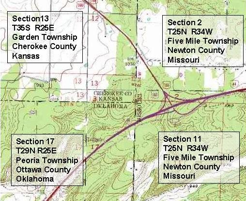
PLSS MAP


The Public Land Survey System is a manner of dividing and describing US public domain lands through a series of rectangular grid surveys, according to standards set by the Bureau of Land Management. PLSS maps are usually divided into 6 mile square townships, which are then sub-divided into 36 one mile squares.

Monday, September 22, 2008

Isobar Map


Certain weather maps allow us to view High and Low pressure systems that control the weather. An isobar is a line connecting locations of equal barometric pressure. Isobar maps show where pressures are relatively high and low, and show us where pressure changes are gradual or dramatic over a distance.


Isopach Map


This type of map is useful in reservoir analysis and reserve estimation. Moreover, along with other maps and data, isopach maps can be used to refine depositional environments. The knowledge of depositional environments can be used to predict reservoir trends and quality.

Dot Distribution Map


Dot distribution maps are sometimes called dot density maps because they show where particular data characteristics occur. Dot distribution maps use dots or other symbols to represent the number of occurrences of a given data characteristic in a particular location. Each dot or symbol used on the map may represent a single entity (one dot = one person) or a group (one dot = 1000 people).

Propoganda Map


Popoganda maps are to created to promote a local area, product or even a person. They are used to make whatever it is your advertising more attractive and appealing through pictures than in real life. They can be used politically to show the potential of your neighbourhood and convince others to move there, to make changes or to invest in new and better product or presidential candidate.

Hypsometric Map


Hypsometric tinting (also called layer tinting, elevation tinting, elevation coloring or hypsometric coloring) is used to enhance elevation zones so map readers can better see differences in relief. The colors selected for the tints are assumed to relate to the ground cover typically found at various elevations in the area being mapped. The highest elevation zone might be white, for snow-capped peaks, the next brown for treeless areas above the tree line, then light green for sparse vegetation on the upper slopes and a darker green for the verdant valleys.

Tuesday, September 16, 2008

Population Profile


Population profiles or population pyramids are commonly used to show the trends in population statistics over time. The first pyramid shows that Kenya has rapid growth .. they have a very young population with high fertility rates and high death rates among their older population.

Similarity Matrix Map


A similarity matrix shows similarity between variables on a scale. They seem to be most popular in studying genetics but this one is being used to study temporal event clustering of digital photo collections and user retrieval times on a scale from zero to one. This matrix visualizes the temporal similarity of a collection of 512 photos.

Correlation Matrix Map


Correlation matrix between the time series of the regions detected as part of a large-scale network. The matrix has been organized to reveal the organization of the regions into sub-networks, ie the matrix has a block-structure, each block corresponding to a group of regions whose temporal activities are highly correlated (bright red diagonal square), and smally or negatively correlated with the activity of other regions (dark or blue off-diagonal rectangles). The diagonal square corresponding to the first sub-network is outlined in light grey.

Doppler Radar


The new Bureau Doppler radars will supply high quality data that will not only allow forecasters to diagnose rainfall but also wind flows in the atmosphere. The image below is taken from the Doppler radar at Buckland Park. The air is moving in the directions shown by the arrows.

Cartogram Map


Cartograms are maps where the geographic unit being looked at has its size and shape altered to reflect the magnitude of the variable being looked at. Algorithms which create cartograms are designed to maintain the approximate scale and positions of the original geographic units as best as possible given the necessary distortions.

Cadastral Map of Czech Republic


The cadastral maps and the corresponding parcel protocols are of great importance and interest to the owners, surveyors, historians, and geographers. They describe the history of the ownership, the course of the boundaries and the land use of all parcels.

Flow Map


Flow Maps sequence and order a process. They identify the relationships between stages and substages of an event (or order or numbers, operations, steps, etc.) They can be used to explain the order of events.

Thursday, September 4, 2008

Isoline Map


Meteorologists use isolines to quickly show these temperature difference on a map. The hottest areas are often colored red, the warm areas yellow, and the cold areas blue. Isolines are effective, because they very quickly communicate the distributions being examined.

Topographic Map


Topographic maps are tools used in geologic studies because they show the configuration of the earth’s surface. On most topographic maps, index contour lines are generally darker and are marked with their elevations. Among other things, a topographic map can be used to measure the average slope of a hill (or hills). This is an example of a piece of land they used to show how a topographic map looks like.

Planimteric Map Of Lake George NY


The black and white planimetric maps include a wide range of information. Transportation data includes all roads and most major trails, railroads, airfields and ferry lines. Roads are symbolized to tell if they are divided or undivided and all ramps and other interchange details are shown. Boundary lines are shown for all cities, villages, towns, counties, and Indian reservations as well as for miscellaneous state and federal lands. These maps are excellent for work on local levels.

Chidren's Mental Maps


This is how children when given a picture of the world and are told to free hand their own map image looks like. If you put this map next to an actual world map it has similarities but isn't as defined as an actual map. Children have an interesting imagination and tend to add shapes and lines where there isn't any. It's a good drawing coming from a child.